8 \(\mathcal{R}\) Lab 2

8.1 Descriptive Statistics
Thusfar, we’ve discussed the mechanics of using \(\mathcal{R}\), and it is now time for applying what we’ve learned.
The data dictionary was detailed in the last lab, but here it is again as a reminder:
- bwt = birth weight in grams (continuous).
- low = low birth weight indicator: low vs norm (factor, reference = low)
- age = mother’s age in years (continuous).
- lwt = mother’s weight in pounds at last menstrual period (continuous).
- race2 = mother’s race (white vs nonwhite) (factor, reference = nonwhite)
- race3 = mother’s race (white vs black vs other) (factor, reference = black)
- smoke = smoking status during pregnancy yes vs no (factor, reference=no)
- ptd = history of preterm delivery yes vs no (factor, reference=no)
- ht = maternal hypertension yes vs no (factor, reference=no)
- ui = presence of uterine irritability yes vs no (factor, reference=no)
- ftv = number of physician visits during the first trimester (continuous, 0-6)
As before, we need to set our working directory to the folder containing our .csv file. Assuming this is a new session, we will need to read the data, define factors, and create any new variables we might want to use. This is where it is convenient to have a code record of your previous operations, which can be applied with a single click.
d=read.csv("bwt.csv", stringsAsFactors=TRUE) # read .csv spreadsheet
d$low<-factor(d$low)
d$low=relevel(d$low, ref="norm")
d$race2=relevel(d$race2, ref="white")
d$race3=factor(d$race3, levels=c("white", "black","other"));
For future use, we can save this revised dataframe in \(\mathcal{R}\) format using the save() command to create a permanent file in the working directory. The load() command can be used to retrieve it later, preserving all the current names, data types, and factor levels.
save(d,file="mydata.Rdata") # save d as a Rdata file
d=get(load("mydata.Rdata")) # re-load dataframe mydata.Rdata and name it d
summary(d)  # confirm revised dataframe had reloaded
Should you need a reminder, you may wish to refer back to the data dictionary for this dataset.
8.1.1 Continuous data
Descriptive statistics are easy to apply to individual variables, such as bwt = birth weight (g).
# DESCRIPTIVE STATISTICS
mean(d$bwt) # apply mean function to individual variables as vectors
var(d$bwt)
sd(d$bwt) # same as sqrt(var(d$bwt))
min(d$bwt)
max(d$bwt)
range(d$bwt) # same as min(bwt), max(bwt)
median(d$bwt)
quantile(d$bwt, probs=c(0.1, 0.25,0.5, 0.75, 0.9)) # sample percentiles
Moreover, the Hmisc package contains a function describe() for describing data frames.
summary(d) #  basic descriptives (5 number)
library(Hmisc) # load package for 'describe()`
describe(d) # more comprehensive descriptives
Correlations and covariances are used to to describe bivariate relationships, in this case between birth weight and pre-pregnancy maternal weight:
# CORRELATIONS/COVARIANCES
cor(d$bwt, d$lwt) # Pearson correlation between two numerics
with(d, cor(bwt, lwt)) # alternatively, the same but more efficiently
with(d, cor(bwt, lwt, method="kendall")) # non-parameteric Kendall tau
with(d, cor(bwt, lwt, method="spearman")) # non-parameteric Spearman rho

with(d, cor.test(bwt, lwt)) # test of significance Pearson r, 95% CI
with(d, cor.test(bwt, lwt, method="kendall")) # concordance based correlation
with(d, cor.test(bwt, lwt, method="spearman")) # rank based correlation
You should now examine the on-line help for ?cor.test, and as an exercise, calculate the Pearson correlation with 90% confidence limits.
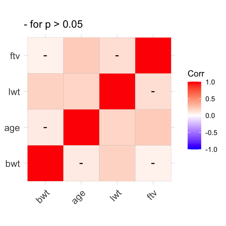
When summarizing relationships between multiple numeric variables simultaneously, journals often present them in the form of covarance or correlation matrices, which are also returned by the cov and cor functions, respectively. In the former, off-diagonal elements are bivariate covariances, and the diagonal elements are variances. In the latter, off-diagonal elements are correlations and the diagonal elements are all equal to 1 i.e. the correlation of a number with itself.
names(d) # to identify the numeric variables i.e. columns 1, 3, 4, 7
d1=d[, c(1,3,4,7)] # d1 contains just the numeric variables
cor(d1) # correlation matrix with 1's on diagonal
cov(d1)  # covariance matrix with variances on the diagnonal
Correlation matrices can also be presented in graphical form, with colour coded coefficients.
We earlier saw how the sapply() function can be used to repeatedly apply a single function to each column in a dataset e.g. to calculate the mean or sd of each numeric column:
The tapply() function is another useful tool that you might file away for later use. It applies a function to single variable in your dataset after first subsetting that variable by group. For example, if you want to summarize birthweight for each race separately, you might first subset your dataset by race and then applysummary() to each of the 3 new dataframes separately. But tapply(bwt, race3, summary) is considerably more efficient.
# apply function=summary to bwt by race3
with(d, tapply(bwt, race3, summary))
# apply function=mean to bwt by race3
with(d, tapply(bwt, race3, mean))
8.1.2 Categorical Data
For categorical data, data are usually summarized as contingency tables of counts. In addition to the summary() function, we can make use of several cross-tabulation functions, including table() and xtabs():
Tables can also be named objects, which can be manipulated or plotted by name.
# tables can be named objects
tab1=with(d, table(race3));tab1 # now present in Environment window
tab2=with(d, table(low, race3));tab2

# tables can be manipulated, plotted (see barplot)
addmargins(tab2) # add row and column totals
prop.table(tab2, margin=2) # margin = 2 for column proportions
prop.table(tab2, margin=1) # margin = 1 for row proportions
A multidimensional 2 x 2 x 3 table can be created by cross-tabulating the low birthweight indictor, race, and maternal smoking status to create a series of 2 x 3 tables, one for each level of smoke:
For publication, it may be a good idea to flatten the multi-dimensional tables:
As an exercise, experiment with the order of the cross-tabulation. What do you think of the incidence of low birth weight among non-white smokers?
Now we want to subset the data to restrict our cross-tabulation to normotensive non-smokers. But we have to be careful. The new dataframe (d1) has exactly the same variable names as the original (d), with 81 fewer rows. So we need to specify the dataframe for the table() command or we will get the wrong answer. This is what we mean by a name clash, which is why in general I prefer not to attach datasets to the general workspace where all objects live.
8.2 Graphics
8.2.1 Distributions
We plot the distribution of continuous data with histograms. The basic command is quite simple, needing only the variable name. It applies the Sturges algorithm to determine the optimal bin size, but we can specify the number of bins (breaks) manually or dress it up via the other options to plot().
with(d, hist(bwt)) # basic command
with(d, hist(x=bwt, breaks=20, col="lightblue",  main="Birth Weight Distribution", xlab="Birth Weight (g)"))
The abline() function can be used to add vertical (v=) or horizontal (h=) lines. Here, we add the median and IQR:
abline(v=median(d$bwt), col="red", lty="dashed", lwd=2) # add median, lwd=width
abline(v=quantile(d$bwt, probs=c(0.25, 0.75)), col="royalblue", lty="dashed", lwd=2) # add IQR
The density() function generates data for a kernel density plot i.e. smoothed histograms. Although the algorithm will select a default bandwidth (smoothing parameter), you may want to experiment
# kernel density plot
plot(density(d$bwt))
plot(density(d$bwt, bw=125), main="Age Distribution") #adjust bandwidth
plot(density(d$bwt, bw=400), main="Age Distribution") #adjust bandwidth
Quantile-quantile QQ plots can be used to more formally assess the normality of a distribution. The analogous function from the car package (Companian to Applied Regression) automatically adds a 95% CI to the best-fit line, which makes it easier to judge normality.
# normal quantile-quantile plot in base R
qqnorm(d$bwt)
qqline(d$bwt) # add best-fit line

# compare to qqplot in car package
library(car) # load car
qqPlot(d$bwt)
qqPlot(d$bwt, main="Testing Normality", ylab="Birth Weight (g)", xlab="Theoretical Quantiles")
As an exercise, plot a histogram, density, and QQ plot for maternal age.
While old school, I still like stem and leaf plots for assessing distributions.
As an exercise, create a stem and leaf plot for maternal age.
8.2.2 Bivariate relationships
Scatterplots are typically used to examine the relationship between two continuous numeric variables. Most of functions we will now use allow us to specify the dataset containing the variables of interest. So we don’t have to use d$… or with(d, …):
We saw earlier that we can also specify colours by number (1=black, 2 = red, etc). Do you remember how to use the show.col() function to find the numeric codes? This can be useful, should we wish to use a variable in the dataset to colour-code the display. For example, race is a factor or class variable, but the unclass() function can be used to retrieve numeric codes, which can be used directly by the col or pch options for colour and symbol :
unclass(d$race2) # 1 = white, 2 = non-white
plot(bwt~lwt, data=d, col=unclass(race2), pch=19,  xlab="maternal weight",ylab="birth weight")
We can also pretty it up by adding a regression line. Here, we use the linear regression function lm(); its results can used by the abline() function to specify intercept and slope coefficients:
# add best fit line with a=intecept, b=slope
model1=lm(bwt~lwt, data=d)
summary(model1)
abline(model1, lty="dashed", col="grey39")
Functions are also provided for adding text annotations. Here, we calculate the correlation and add it to specific co-ordinates with the text() command:
# add text
cor1=round(cor(d$bwt, d$lwt),2);cor1
txt1=paste("r =", cor1);txt1
text(x=225, y = 4800, labels=txt1)
We’ve already seen how we can add plot layers in the form of points() and lines(). Here, we use the latter to add a non-linear lowess smooth:
And legends can explain your graph to the reader:
# add legends
legend(x="bottomright", col=c(1,2), pch=19, legend=c("white","nonwhite"), bty='n')

legend(x="topleft", lty=c("solid","dashed"), col=c("royalblue","grey39"), legend=c("loess","linear"), bty='n')
As an exercise, plot maternal weight vs maternal age, and add a regression line and lowess smooth.
Boxplots display relationships between continuous and categorical data e.g.by summarizing the distribution of birthweight for each race category:
As an exercise, plot birthweight vs maternal smoking:
Box plots are used to display counts or frequency data from contingency tables. They can be used to plot a vector (single column) of bar heights:
If instead we furnish a matrix (multiple columns) of heights, a stacked bar chart is created, where each bar represents a table column:
tab2 # a matrix 2 x 3
barplot(tab2) # same as barplot(height=tab2), rows->bars
barplot(tab2, density=c(20,10)) # shade bars for publication
Of course, barplot() accepts the usual plot options:
# decorate with plot options
barplot(tab1, main="Newborn Racial Distribution", col=c("blue","red","yellow"), xlab="Race", ylab="Counts")
legend("top", fill=c("blue","red", "yellow"), legend=c("white","black","other"), bty='n')
And can be flipped horizontally by specifying the option horiz=TRUE:
# horiz=TRUE
barplot(tab1, main="Newborn Racial Distribution", col=c("blue","red","yellow"), xlab="Counts", ylab="Race", horiz=TRUE)
A stacked bar chart can be converted to a grouped barchart by specifying beside=TRUE:
# grouped bar chart (beside=TRUE, horiz=TRUE)
barplot(tab2, col=c("darkblue","red"), main="Racial distribution: LBW", xlab="Counts", ylab="Race", beside=TRUE, horiz=TRUE)
legend("topright", fill=c("darkblue","red"), legend=c("Norm","Low"), bty='n', cex=0.8)
As an exercise, create a bar chart for counts of low birth weight by maternal smoking status:
8.3 Comparing Groups
8.3.1 Comparing means
These examples follow directly from the our earlier discussion of basic (two-group) statistical inferences. First, we wish to compare mean birthweight in whites vs non-whites using a two-sided t-test, which uses the formula notation:
But there are many options to the t-test, which you can explore via the the help with ?t.test. By default, alternative = "two.sided" for a two sided or non-directional hypothesis. As we discussed, we might sometimes wish to apply a one-sided hypothesis. As long as we know how we’ve defined our levels, a one-sided test is specified via alternative="greater" (mean of level 1 > mean of level 2).
?t.test
# one-sided hypothesis (group 1 > group 2 i.e. white > nonwhite)
t.test(bwt~race2, data=d, alternative="greater")
Although the t-test is relatively robust to non-normality of the underlying data, there are also non-parametric alternatives, such as the Wilcoxon rank sum test (\(\equiv\) Manny Whitney U test), which is also available as a one-sided or two-sided test.
# Mann Whitney U: bwt vs race2 (Wilcoxon Rank Sum Test)
wilcox.test(bwt~race2, data=d)
wilcox.test(bwt~race2, data=d, alternative="greater")
In an as yet unwritten chapter, we will see that the Analysis of Variance or ANOVA procedure generalizes the t-test for comparing means between \(\geq\) 3 groups. The same syntax applies within the aov() function:
# ANOVA for 3 group comparison
anova1=aov(bwt~race3, data=d)
summary(anova1) # overall test of significance
In this case, the 3 group means differ, but this does not tell us which groups differ specifically. Naively, we might be tempted to localize the difference through pairwise t-tests, but this does not account for the multiple comparisons. What we really want to do is to limit the overall or ‘family-wise’ type I error rate to p \(<\) 0.05. There are several approaches to doing so, with Tukey’s Honest Significant Difference (HSD) easy to apply to the ANOVA results we just created.
When performing multiple comparisons, you should appreciate that each additional comparison increases the probability of at least one type 1 error (false positive). Given m comparisons at p < 0.05, the probability of at least one type I error is 1-0.95m = 50% after 13 comparisons!! Avoid fishing expeditions and adjust for multiple comparisons when needed!
As an exercise,
Compare birth weight by maternal smoking exposure, with both parametric and non-parametric tests. How similar are the results?
Compare maternal weight in each of the 3 race categories, adjusted for multiple comparisons. How do you interpret the TukeyHSD output?
Perform a t-test comparing birth weights in black and white newborns in the dataset. How does this p-value compare to that above where we adjust appropriately for multiple comparisons using the TukeyHSD test?
8.3.2 Comparing proportions
When comparing counts, we first need a contingency table For example, here is the cross-tabulation of low birth weight and race (white vs non-white).
# CREATE TABLE OF COUNTS
tab6=with(d, table(low, race2));tab6
prop.table(tab6, margin=2) # margin = 2 i.e. column percent
In this case, the chi-squared test is a test for homogeneity across categories i.e. do the numbers of low and normal birthweight babies differ by race. The null hypothesis is that there is no relationship between the row and column variables. Recall that the chi-squared test assumes that all expected cell counts are \(>\) 5. If this assumption is not met, the Fisher Exact test is more appropriate.
In this case, we reject the null hypothesis at p \(<\) 0.05 and conclude there is a relationship between low birth weight and race.
As an exercise, return to the table above (tab4), where we tabulated counts of low birth weight by race for just the non-smoking and normotensive mothers. Create a barplot showing the counts by race category, and test for an association between low birth weight and race in this subset of mothers. Do racial differences in maternal smoking and blood pressure explain the differences in low birth weight? Are the assumptions of the chi-squared test met?
8.4 Homework Exercises
After the first lab, you were asked to import the childiq dataset. We will now use this dataset. As always, we first need to explore the dataset:
Calculate descriptive statistics
Graphically explore the data distributions
Explore the relationship between childhood scores and maternal IQ in terms of their correlations and scatter plots
Graphically explore the relationship between mean childhood scores and maternal education. Perform an appropriate quantitative test
Cross-tabulate mom’s highschool completion with work category, as both counts and proportions. Test for an association between these two variables. How do you interpret these results?