15 GLM Lab
The preceeding discussion of statistical modeling has been quite detailed, largely because the generalized linear model is an essential implement in your statistical toolbox. Now, we would like you to apply what you’ve learned with a concrete example, building and running an appropriate model, interpreting its output, and assessing its validity. For this, we will work with the childiq.csv dataset, which you should already have imported into \(\mathcal{R}\). You may wish to take a moment to review the earlier homework.
15.1 ChildIQ
The data file childiq explores the relationship between childhood academic tests scores and maternal IQ/ education in 434 monther-toddler dyads:
kid_score: standardized scholastic tests scores: continuousmom_iq= maternal IQ (Stanford Binet): continuousmom_hs= maternal highschool completion: factor NoHS vs HS, ref=HSmom_age: maternal age (years): continuousmom_work= type of employment 1-4: factor, ref= year1- year1: full-time in first year of child’s life
- year2: didn’ work during child’s first year
- year3: didn’t work during first 2 years of child’s life
- year4: didn’t work during first 3 years of child’s life
First, set your working directory to the folder with the .csv file using the Session:Set Working Directory menu. If you prefer, you can also replace the file name (childiq.csv) with file.choose() and navigate to your data file.
Once imported, we confirm the default data types and descriptive statistics. In this case, we should see that factors have been correctly identified and reference (baseline) categories chosen appropriately:
15.1.1 Model Building
The scatterplotMatrix() function in the car package provides a quick look at data distributions, bivariate relationships, and best-fit regression lines. The frequency histograms on the diagonal and the first row (bivariate relationships between kid_score and the individual predictors) are particularly helpful. The off-diagonal elements can identify correlated predictors e.g. row 3, column 2 is the bivariate relationship between maternal high-school status and IQ, with higher IQ’s in the group that completed HS. This is what we mean by collinearity and may lead to variance inflation/ type II errors.
You may need to click the Zoom button in the Plots panel for a better view, and the Export button allows you to copy and save plots. In general, pdf format is recommended, since it can be edited in Adobe Acrobat Pro (labels, lines, etc) and converted to any high-resolution graphic format required by individual journals. NB: Avoid the temptation of copy-pasting into MS Office, which automatically converts the image to a low resolution graphic that is usually unsuitable for publication.
Let’s explore a couple of those relationships more closely:
# examine relationships more closely
 boxplot(kid_score~mom_work,data=d) # kid IQ vs mom work

plot(kid_score~mom_iq, data=d) # kid IQ vs mom IQ
  abline(lm(kid_score~mom_iq, data=d), col="grey") # add best fit linear
  lines(lowess(d$kid_score~d$mom_iq), col="red")  # add lowess smooth
It’s hard to find a convincing explanation for the relationship between child test scores and maternal work status, and these differences are probably random variation. The relationship between childhood and maternal IQ may shows some curvature and appears to plateau eventually; a quadratic term may be worth including.
Since we’re unfamiliar with the standardized testing (kid_score), let’s look at its distribution more carefully, deliberately choosing percentiles that correspond to z = - 2, -1, 0, +1, + 2. How does it compare to the standard Wechsler IQ test for older children and adults? Recall that by design, IQ testing has a median = 100 and SD = 15? How does maternal IQ compare to the expected distribution?
# EMPIRIC DISTRIBUTIONS
# Child testing
with(d, hist(kid_score))
# z= -2, -1, 0,  +1, +2
quantile(d$kid_score, probs=c(0.025, 0.15, 0.5, 0.85, 0.977) )
sd(d$kid_score)

# Maternal IQ
with(d, hist(mom_iq))
quantile(d$mom_iq, probs=c(0.025, 0.15, 0.5, 0.85, 0.977) )
sd(d$mom_iq)
Since our outcome is continuous, multivariable linear regression is our model of choice. However, we have a number of potential predictors.
For categorical variables (factors), we’ve previously alluded to the importance of correctly ordering levels and appropriately assigning baseline or reference categories. In regression modeling, the interpretation of \(\beta\) parameters for factor variables depends on both their ordering and the method selected for comparing across categories (aka contrasts) .
We can ask \(\mathcal{R}\) which system of contrasts it uses by default.
Unless we’ve made changes to the default selections, it should tells us that nominal (un-ordered categorical) variables are compared by Treatment Contrasts, where each level is compared to a baseline or reference level. However, ordinal factors are compared using Orthogonal Polynomial Contrasts that test for uncorrelated linear, quadratic, cubic, … effects.
It may be important to know which system of contrasts you’re using, since there are many choices, including
-
Treatment Coding: Compares each level of a variable to the reference level
-
Forward Difference Coding: Compares adjacent levels of a variable (each level minus the next level)
-
Backward Difference Coding: Compares adjacent levels of a variable (each level minus the prior level)
-
Helmert Coding: Compare levels of a variable with the mean of the subsequent levels
-
Reverse Helmert Coding: Compares levels of a variable with the mean of the previous levels
-
Deviation Coding: Compares deviations from the grand mean
-
Orthogonal Polynomial Coding: Orthogonal polynomial contrasts
-
User-Defined Coding: User supplies a custom contrast matrices
If you’re not using \(\mathcal{R}\), bear in mind that different statistical systems may choose different default contrasts (e.g. weirdly enough, \(\mathcal{S}\) uses Reverse Helmert Coding, where each \(\beta\) compares it’s level with the mean of the lower levels!). Details matter. For the most part, stick with the defaults, as treatment and orthogonal polynomial contrasts are easy to interpret. If the time comes, you may want to read more about factor contrasts.
When we talked about how categorical variables are coded, we discussed dummy or indicator (0-1) variables. It is sometimes helpful to review how the variables are explicitly coded by applying the constrasts() statement to the individual factors. Recall that in general, a categorical variable with k levels is coded as k-1 dummy (0-1) variables, and the reference level sets them all to zero (aka Treatment Contrasts).
It’s not often necessary to inspect the dummy indicators directly, but if you’re seeing numbers other than zeros and ones here, you need to be careful about how you’re interpreting your results.
# display contrast matrix
contrasts(d$mom_hs) # 2 levels, HS = reference category
contrasts(d$mom_work) # 4 levesl, year1 = reference category
In general, there’s nothing wrong with building a model through graphical exploration. In the homework, you were also asked to perform some additional comparisons (t-tests, correlations), which could also inform your selection of variables and their need for transformation prior to use.
In bivariate screening, we discussed the role of single predictor models when building the full model. Remember, we’re not looking for statistical significance as much as we want to identify candidates for inclusion in the final model (e.g. p \(<\) 0.2 is often good enough :). Moreover, there are going to be variables we want to include even if the screening results are not promising e.g. obligate predictors based on theory or hypothesis, such as maternal IQ (our primary exposure) or maternal age.
Take a moment now to interpret the parameter estimates and p-values from the bivariate screening? Which variables do you think should be included in the final model? Formulate a main effects model.
15.1.2 Main Effects
Based on our scatterplot matrix, we might consider the following main effects, since maternal work-status does not appear to be related to test scores in a sensible way.
\(kid.score = \beta_0 + \beta_1 \cdot mom.iq + \beta_2 \cdot mom.hs + \beta_3 \cdot mom.age\). Fitting the model with the lm() function is familiar by now.
# main effects model: kid_score vs mom_iq, mom_age, mom_hs
lm_main<-lm(kid_score~mom_iq + mom_hs + mom_age, data=d);summary(lm_main)
Interpret the coefficients. Comment on the implications of the change in p-value for maternal age in moving from the univariate to the multivariable model? Could this be a type II error?
We can further explore by adding non-linear terms, particularly since diagnostic tests will later suggest the need for a quadratic term in maternal IQ, here added as I(mat_iq^2). Note the use of I() to force evaluation of the exponentiation inside the parentheses before fitting the model.
15.1.3 Interactions
Perform a stratified analysis for the relationship between test scores and maternal IQ based on high-school completion status. Interpret the difference in coefficient estimates; which group “starts lower and rises faster”?
# is there an interaction mom_iq and mom_hs
lm5_NoHS<-lm(kid_score~mom_iq, data=subset(d, mom_hs=="NoHS"));summary(lm5_NoHS)
lm5_HS<-lm(kid_score~mom_iq, data=subset(d, mom_hs=="HS"));summary(lm5_HS)
The fact that the slopes are (quite) different between the two groups speaks to an interaction term between maternal IQ and high-school completion. Explore this difference graphically in an interaction plot, using different symbols for the two groups and separate regression lines:
plot(kid_score ~ mom_iq, data=d, col=unclass(mom_hs), pch=unclass(mom_hs)+19, main="Interaction Plot")

abline(lm5_HS, lty=1, col=1, lwd=2) # add line for HS graduates, lwd=line width
abline(lm5_NoHS, lty=2, col=2, lwd=2) # add line for HS dropouts
legend("topleft", pch=c(20,21), col=c(1,2), lty=c(1,2), legend=c("HS", "NoHS"), bty="n")
How would we determine the statistical significance of this interaction?
# add an interaction effect to main effects model
lm6<-lm(kid_score~mom_iq + mom_hs + mom_age +  mom_iq:mom_hs, data=d)
summary(lm6)
How do you interpret the magnitude and the p-value for the interaction term?
You may be confused by the impact of NoHS education, which implies the intercept is 52 points lower in children of less educated mothers. Remember that the intercept is expected value when all predictors = 0, and we don’t really expect to see mothers with age and IQ equal to 0 i.e. the intercept has no biological interpretation. To facilitate interpretation, it may be helpful to center the maternal IQ and age variables by subtracting their mean values. Now, the intercept refers to the expected value at the average maternal IQ and age.
# center numeric values to re-position intercept
d$mom_cage=d$mom_age - mean(d$mom_age)
d$mom_ciq=d$mom_iq - mean(d$mom_iq)
lm6b<-lm(kid_score~mom_ciq + mom_hs + mom_cage +  mom_ciq:mom_hs, data=d)
summary(lm6b)
Interpret the new coefficients. Notice that centering doesn’t affect the slopes, only the intercepts.
How is the R2 (or adjusted R2) affected by the addition of the interaction term? How do you decide if it’s worth including?
P-values can be misleading, since they are affected by sample size (with large enough n, even small differences can be signficant). Many journals insist on 95% confidence intervals, which contain the same information. In the next output, which coefficient estimate crosses 0, and what does this imply?
15.1.4 Effects plots
Interactions and non-linear terms can be hard to explain verbally. For example, let’s look at a model with both types of effects:
lm7<-lm(formula = kid_score ~ mom_iq + I(mom_iq^2) +  mom_hs + mom_age +  mom_iq:mom_hs, data = d)
summary(lm7)
Rather than describing these relationships, we can create effects plots to illustrate both the non-linear relationship and the interaction term (you may need to click Zoom to see this figure properly). In each plot, we see a specific relationship, where any other terms have been averaged over.
Interpret the effects plots. What does the wide CI in the plot for test score vs maternal age mean?
15.1.5 Model Predictions
All modeling functions in \(\mathcal{R}\) comes with predict() functions that allows you to apply the fitted model to either the study sample or a new dataset e.g. to validate the model on external data or plot results for specific (idealized) patient groups:
15.1.6 LRT
Wald tests test individual \(\beta\) estimates against the null hypothesis \(\beta\) = 0. Sometimes, we want to compare models that differ by more than a single term. For example, maternal education appears as both a main effects and an interaction term, and no single Wald test assesses its significance. We can however, apply the likelihood ratio test (LRT) to compare two nested models:
# lm6: kid_score ~ mom_iq + mom_hs + mom_age + mom_iq:mom_hs
lm8=lm(kid_score ~ mom_iq + mom_age, data = d)

# likelihood ratio test
anova(lm6, lm8, test="F")
We’ve been using the lm() function for linear modeling with Gaussian errors. We should remember that the linear regression model is a special case of the generalized linear model, and we could just as easily use the glm() function with identity link and Gaussian family:
# Gaussian linear model is special case of GLM
glm_main<-glm(kid_score ~ mom_iq + mom_hs + mom_age, data=d, family="gaussian")
summary(glm_main)
Note that the coefficient estimates are (as expected) exactly the same, since maximum likelihood estimates and least square estimates are identical for the Gaussian model. However, the ANOVA table at the bottom of the summary output has been replaced with an analysis of deviance, with the residual deviance taking the place of the mean square error.
15.1.7 Diagnostics
Feel free to omit this section on first reading. It is included for the sake of completeness.
In our first lab, we saw that linear model objects (results) respond to the plot() function by generating a series of diagnostic plots.
A more focused approach requires the investigator to ask specific questions about their analyses (see lecture notes). Above, we saw how the significance of maternal age vanished when added to the multivariable model and wondered whether collinearity with variance inflation might have led to a type II error.
# collinearity -> false negative Wald tests
# VIF = 1 if no variance inflation, VIFs < 5, 10 'acceptable'
vif(lm_main)
The effect of maternal age disappeared after adjustment for maternal IQ and education, and this was not spuriously related to collinearity.
In addition examples, model residuals are returned automatically and can be used to test for normality:
# Test normality of residuals
hist(residuals(lm_main), main="Does this look normal?")
qqnorm(residuals(lm_main)) # built-in
library(car) # load car package for qqPlot()
qqPlot(lm_main, id.n=3) # identify 3 most extreme values by row no.
A residual plot of \(y_i\) vs \(\hat{y_i}\) can be used to assess the constant variance assumption and identify outliers (large residuals):
The same plot can be included with a panel of plots of \(y_i\) vs individual predictors (\(x_i\)), which can be assessed for non-linear patterns that suggest a curvilinear relationship needing higher order quadratic or cubic terms: cubic,…). The output includes a ‘curvature’ test, where p \(<\) 0.05 speaks to a non-linear quadratic relationship for invididual predictors. Here we see evidence that mom_iq may need to be modeled non-linearly (the Tukey test is for overall fit, which is redundant in this case).
Both index plots and bubble plots can be used to identify outliers (extreme y’s), leverage (extreme x’s), and influential observations.
# influence, outlier, leverage plots with labels for 3 largest
infIndexPlot(lm_main, vars=c("Cook", "Studentized", "hat"), id.n=3)
influencePlot(lm_main, main="Bubble Plot")
Personally, I find the bubble plot easiest to interpret. To be worrisome, observations must be both extreme (outliers are studentized residuals \(\gt\) 2-3; leveraged points are hat-values \(>\) 2-3 \(\bar{h}\)) and influential (Cook’s D \(\gt\) its critical value). In this case, observations 111 and 286 may be worth looking at.
The dfbetas() function estimates the change in individual parameter estimates if the concerning observations are dropped. To faciliate comparisons, these are standardized estimates i.e. divided by their standard errors (though more difficult to interpret, the functions dfbeta() and dfbetaPlots(), without the s, return raw estimates). From these influence plots, we see that neither of the 2 influential observations are having an impact on the effect of mom_iq, which is our primary interest. However, they may be influencing the estimate of the mom_hs effect.
dfbetasPlots(lm_main, id.n=3) # id 3 most influential obs
dfb=dfbetas(lm_main); # all dfbetas
dfb[c(111,286),] # display worrisome obs
Of course, you can also repeat the regressions after dropping the worrisome rows:
lm1<-lm( kid_score ~ mom_iq + mom_hs + mom_age, data = d[-111,]);summary(lm1)
lm2<-lm( kid_score ~ mom_iq + mom_hs + mom_age, data = d[-286,]);summary(lm2)
Since the results are qualitatively unchanged, we conclude that we shouldn’t be too worried about unduly influential observations.
NB: A ‘simple’ regression involves a lot of work
15.2 Low birth weight
We previously created an \(\mathcal{R}\) dataframe d, which we saved in our working directory. Let us re-load it now (depending on where you saved it, you may need to set your working directory):
If you need to be reminded, the data dictionary can be found in the first lab.
In the original source Applied Logistic Regression, 2013, the authors explore individual predictors through a series of univariate logistic regressions to identify candidates for inclusion in the final model (bivariate screen). Your screening could also be based on a series of two-dimensional cross-tabulated counts and chi-squared tests. In addition to predictors that need to be included based on prior literature and you’re specific hypothesis, you’re interested in identifying variables that are at least weakly associated with the outcome as you build your final model.
We’ve seen this example previously:
Typically, we will exponentiate (anti-log) the parameter estimates and confidence intervals to create odds ratios. On the new scale, the null hypothesis of no association implies an OR = 1. If the 95% CI crosses 1, we will accept the null hypothesis of no association, p \(>\) 0.05.
exp(glm1$coefficients) # odds ratio through anti-log
exp(confint(glm1)) # 95% confidence interval on odds ratios ( ?cross 1)
15.2.1 Main Effects Model
Hosmer and Lemeshow identified the following main effects model
with the following odds ratios and OR CI’s. Take a moment to interpret them. Are the results in keeping with what you expected based on clinical experience?
Other GLM work similarly. For example, if you change the left-hand response to a count variable and set family = “poisson”, you’ll get a Poisson count model.
15.2.2 Evaluating model performance
Like lm(), the glm() function also has the option to predict outcome by applying the fitted model to either the current dataset or new data . However, you must decide whether you want to predict the probability of low birth weight (LBW) on the original 0-1 scale (type="reponse") or on the linear predictor scale (type="link"). If we plot predicted probabilities against the value of the right-hand side (the linear predictor), we will see the non-linear S-shaped curve of the logistic regression model:
 #Prediction Performance p vs linear predictor: S-shape
 pred2=predict(glm2, type="response");head(pred2) # original 0-1 scale
 plot(pred2~glm2$linear.predictors, xlab="Linear Predictor", ylab="Prob of LBW", main="Logistic S-curve", pch=19)
As you’ve learned elsewhere in this course, you may want to evaluate the sensitivity (true positive rate) and specificity (true negative rate) of your prediction model. This requires a threshold. For example, you may want to assign anyone with a predicted probability \(>\) 50% as ‘positive’. Since this threshold is arbitrary, receiver-operator characteristics (ROC) allow you to assess overall discrimination performance without selecting a specific threshold. The ROC curve is just a plot of sensitivity vs specificity as the threshold is varied from (in this case) 0 to 1, and there are a number of packages that support this functionality e.g. pROC.
 # ROC curve to assess discrimination performance (c-statistic)
 library(pROC)
 roc1<-roc(d$low, pred2, plot=TRUE, ci=TRUE, main="LBW ROC");roc1
The area under the receiver operator curve (C-statistic or AUC = 0-1) measures the overall discrimination performance, where the diagonal line of chance agreement has an AUC of 0.5 and is no better than random chance. If the 95% CI crosses 0.5, the result is no better than a coin flip (p \(>\) 0.05).
In the real world, it’s important to understand that the so-called ‘optimal threshold’ depends on the intended application e.g. is this a screening test - where you might want high sensitivity and few false negatives - or a diagnostic test? Ultimately, you as a clinician will make this decision. Of course, that hasn’t stopped us from trying to create statistical definitions. You will notice that the top left corner of the plot (sensitivity = specificity = 1) identifies a perfect test, and the topleft criterion will find the closest point on the curve to this Platonic ideal. Similarly, the Youden criterion finds the point on the curve that maximizes the sum of sensitivity and specificity. In this case, the two definitions happen to agree:
15.2.3 Diagnostics
Again, these are intended as a template for your own work. In general, diagnostics need to be tailored to the specific GLM. For example, we’re no longer concerned with the normality of the residuals, since the logistic regression model makes no such assumption.
For more information, consult Fox’s Companion to Applied Regression or Extending the Linear Model by Julian Faraway.
Since we always worry about collinearity (predictor correlations with type II errors), variance inflation factors should be checked routinely. VIF’s \(<\) 5 don’t concern us.
Although the logistic model is non-linear, it is linear on the link scale (after the logit transformation on the left-hand side of the model). The crPlots() applies equally well to the linearized GLM:
And we should always search for extreme values (outliers and leveraged) and influential observations (Cook’s D). The results that worry us the most are both extreme and influential. As before, you can use index or bubble plots to identify worrisome data points.
# EXTREME VALUES INDEX PLOTS:
infIndexPlot(glm2, vars=c("Studentized", "hat","Cook"), id.n=3) # 147, 183

# Bubble Plot
influencePlot(glm2, main="Area proportional to Cook's D", ylim=c(-3,3))
The dfbetas() function will estimate the influence of each observation on individual parameter estimates. Again, these are standardized by division by their standard errors so that they can be more easily compared.
Or we can simply drop the worrisome observations before refitting the model:
# how influential?
summary(glm(low~lwt+race2+smoke+ptd+ht, family=binomial, data=d[-51,]))
summary(glm(low~lwt+race2+smoke+ptd+ht, family=binomial, data=d[-147,]))
Were the results changed qualitatively by omission of the potentially influential observations? Should we be concerned?
15.3 Breastfeeding
These data are from Klein and Moeschberger (Springer, 1997), Survival Analysis Techniques for Censored and Truncated Data. These data were collected annually between 1978-1986 by the National Longitudinal Survey of Youth to examine temporal trends in breast-feeding habits in young mothers i.e. year was the primary exposure, with a number of other predictors identified a priori.
We’re going to use the data to demonstrate a time-to-event analysis, since the “survival time” is actually the duration of breastfeeding i.e. the event that will take the place of death is stopping breast-feeding. The data are typically right-censored, in that some babies had completed breast-feeding (“died”) when they were lost to follow-up while others were still breastfeeding (“censored”). Recall that babies could be ‘lost to follow-up’ while still breast-feeding at the end of the study, if they withdrew from the study, if they moved without forwarding addresses, etc. Regardless, we would like to include all the data we have when studying ‘time-to-event’ to avoid biasing our results by ignoring the censored cases.
As usual, we provide a short data dictionary:
duration: continuous, duration of breast feeding, weeks
censor: indicator of completed breast feeding (1=yes, 0=no)
race: factor, maternal race, (1=white, 2=black, 3=other)
poverty: factor, maternal poverty (no, yes)
smoke: factor, maternal smoking at birth (no, yes)
alcohol: factor, maternal alcohol use at birth (no, yes)
age: continuous, maternal age of mother in years at birth of child
year: continuous, year of birth (78-86)
yschool: continuous, maternal education in years
pc3mth: factor, prenatal care after first trimester (no, yes)
d=read.csv("bfeed.csv", stringsAsFactors=TRUE)
summary(d)
d$race<-factor(d$race)
d$race=relevel(d$race, ref="white") # make white the baseline
In total, there are 927 subjects (rows) in the dataset, which you can confirm via dim(d). Whether we’re planning a Kaplan-Meier analysis or a regression model, we need to first create a column of survival times where the censored observations are marked (+), using the Surv() function in the survival package.
library(survival) # load library

# create survival object with censored marked (+)
d$survival=with(d, Surv(time=duration, event=censor));
head(d,8)
From the output, we can see that baby 4 was still breast-feeding at 4 weeks when the lost to follow-up. Similarly, baby 8 was still breast-feeding at 8 weeks. It should be clear that if we were to simply study the average duration of breast-feeding without these babies, we will bias our results (since those lost to follow-up will typically have shorter durations).
The primary response is duration of breast-feeding or time at last follow-up, measured in weeks. The primary exposure the year of birth (year, 1978-1986), a continuous variable.
A Kaplan-Meier plot comparing annual cohorts might be hard to interpret given 9 groups with relatively small numbers in each. Nevertheless, we can use the Kaplan-Meier analysis to compare median survival for each cohort using the survfit() function in the survival library, and we can compare the observed survival with what would be expected under a null hypothesis of no difference between groups.
d$fyear=as.factor(d$year) # make factor for grouping
with(d, table(fyear)) # count by year

# Kaplan Meier comparison of groups
km=survfit(survival~fyear, data=d);km

# test KM curves for significance
survdiff(survival~fyear, data=d)
What is happening to median ‘survival’ (breast-feeding duration) over time? Are these differences significantly different from what would be expected under the null hypothesis.
With 9 annual cohorts, these results are hard to interpret. Moreover, we expect temporal trends to evolve gradually over time. In this case, a regression of hazard on year might make more sense.
From the output, the hazard ratio exp(coef) associated with year is 1.05 (p \(<\) 0.003), which implies that that the hazard increased by 5% per year during the study period, or 1.059 = 1.55 (155%) over the 9 years. Under the proportional hazards assumption of this model, this risk doesn’t change over time, but we need to formally check this assumption.
While there appears to be a temporal trend in breast-feeding habits, it’s possible that it was explained by other factors, such as changes in poverty prevalence, quality of prenatal care, or ethnic mix. Hence, the other predictors collected by the investigators, which were identified a priori as potential confounders. For this reason, they could all be regarded as ‘obligate predictors’ for inclusion in the full regression model. With 892 events, this easily survives Peduzzi’s rule of 10 for survival models (10 events per model parameter). Typically, we examine individual associations (e.g. in a series of univariate Cox models) so we can compare adjusted and unadjusted risk; here, we jump directly to the full model.
model2<-coxph(survival~year + race + poverty + smoke + alcohol + age + yschool + pc3mth, data=d)
summary(model2)
What happens to the impact of year with additional adjustment? How do you interpret the other hazards in the model?
You should note the positive (HR \(>\) 1) hazard ratios associated with year, race, smoking. Are these what you expected clinically? In contrast, poverty and education appear to be extend the breast-feeding duration (HR \(<\) 1). Do these results make sense? What does it mean when the 95% CI crosses 1?
Are there interactions that are worth considering? How would you explore them?
15.3.1 Diagnostics
Proportional Hazards
GLM are fitted by maximizing a likelihood function, which means you have to know the probability distribution of the response variable (e.g. Normal, Logistic, Poisson, etc). There are survival times models that model the time-to-event explicitly using specific probability distributions e.g. Exponential, Gompertz, Gamma, etc. Also known as ‘accelerated failure time models’, they are perfectly reasonable choices, if you have some idea as to the shape of the expected survival time distribution.
In 1972, Cox realized that a regression model for the hazard function had an extraordinary advantage: In the mathematical expression for the likelihood function that is maximized, he realized that the shape component cancelled out, and investigators no longer needed to specify a survival distribution in advance, although it can be estimated after the fact. More than anything else, this relative simplicity explains the popularity of the model. However, this mathematical convenience comes at a cost in the form of the proportional hazards assumption, which requires that the \(\beta\)’s be constant with time. Verification of this assumption depends on a new type of residual, called the Schoenfeld residual. The basic idea is straightforward: For each predictor and each (non-censored) observation, we can calculate a Schoenfeld residual, which can be used to estimate the value of \(\beta_i\) at that particular time. A plot of these residuals against time should yield a flat line if the proportional hazards assumption is satisfied.
Schoenfeld residuals are calculated and plotted using the cox.zph() function in the survival package.
par(mfrow=c(3,3)) # set up plot window 3 rows, 3 cols
dx=cox.zph(model2); # calculate Schoenberg residuals
plot(dx) # display test for PH
Typically, visual inspection is sufficient to judges whether the residuals confirm the PH assumption (the dashed 95% CI’s make this easier). Purists may want to formally test the the ‘horizontalness’ of the line with Harrell’s rho, which is essentially it’s correlation. If p \(>\) 0.05, the correlation is zero and PH is sastisfied. That said, I rely primarily on visual inspection of the plots, since even small deviations from the horizontal become statistically significant if n is large enough.
In the output above, you get a PH test for each \(\beta\) and for the overall model (GLOBAL). How do you interpret these results?
In addition, we should check for extreme and influential observations and assess linearity in the relationship between the log-hazard and individual predictors. For details, consult the on-line appendix to Fox’s Companion to Applied Regression.
15.4 Homework assignment
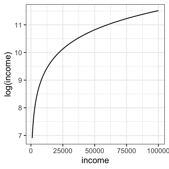
In the course folder, you will find a dataset nations.csv, which contains UN data on infant mortality in 207 countries and per capita gross domestic product (GDP). You will notice that the GDP for each country has been log-transformed (column name = logGDP). Economists often choose to work with log-transformed incomes. You just need to understand that a log transformation doesn’t affect the direction of any regression relationships, since income and log(income) always increase/ decrease together. As you learned in high school, the relationship looks like this:
Columns in the dataset include
infant.mortality = infant deaths per 1000 live births
logGDP = natural log of the per capita gross domestic product measured in US dollars.
TFR = total fertility rate (number of children per mother \(\equiv\) family size )
contraception = proportion of population with access to family planning programs
region = Africa, Europe, Americas, Asia, or Oceania
nation = country (a label, not a predictor)
By treating infant mortality as the dependent variable (y) and logGDP as the predictor of primary interest, develop a main effects regression model for predicting infant mortality rates though exploratory analysis. Distinguish numeric and categorical predictors. Why can you not use nation as a predictor? For easier interpretation, you may want to make “Americas” or “Europe” the reference category for region.
Explain in your own words the meaning of the regression coefficients their p-values.
What is the relationship between infant mortality and logGDP?
What is the relationship between infant mortality and access to family planning?
What is the relationship between infant mortality and family size?
What is the relationship between infant mortality and geographic region?
Are these causal relationships? Why or why not?
Explain the meaning of the R2 statistic for the fitted model. Was the value surprising?
Bonus1: Economists often prefer studying the effects of income (e.g. GDP) after first taking the logarithm. Why do you think we used the log transform here? If you’re not sure, convert
logGDPback toGDP, and plot the relationship between infant mortality and per capita GDP. Since this is a natural logarithm, you can recover the original GDP (in US dollars per person) via GDP = elogGDP =exp(logGDP).Bonus2: If you’re feeling particularly ambitious, perform some basic diagnostic tests to assess model validity e.g. examine the residual plots and exclude problems with collinearity. What are they telling you?