2 Descriptive Statistics
2.1 Data summaries
Continuous numeric variables are summarized by their
central tendency e.g. mean, mode, or median
dispersion (spread) e.g. standard deviation or interquartile range (IQR)
arithmetic mean: \(\bar{x} =\frac{1}{N} \sum_{i=1}^N x_{i}\)
sample variance \(s^2 = \frac{1}{N-1} \sum_{i=1}^N (x_{i}-\bar{x})^2\)
population variance \(\sigma^2 = \frac{1}{N} \sum_{i=1}^N (x_{i}-\mu)^2\)
Notice the difference between the population and sample variances. Since we don’t usually know the population mean \(\mu\), we have to substitute the sample mean \(\bar{x}\). Not only does this introduce uncertainty in the estimate, it also reduces the degrees of freedom from N to N-1. As we will see with regression methods, it is generally true that we lose one degree of freedom for each parameter we have to calculate. For those with morbid curiousity, we’ll discuss this again when we talk about statistical models, but you should appreciate that the difference can be significant, particularly in small samples.
2.2 Normal (Gaussian) distributions
The Normal or Gaussian distribution is often used for modeling continuous numeric x = -\(\infty\) to \(\infty\). Useful features include the following:
It is unimodal (one peak) and symmetric (the same on either side of the mean)
It is completely defined by 2 parameters: \(\mu\) (mean), \(\sigma\) (SD)
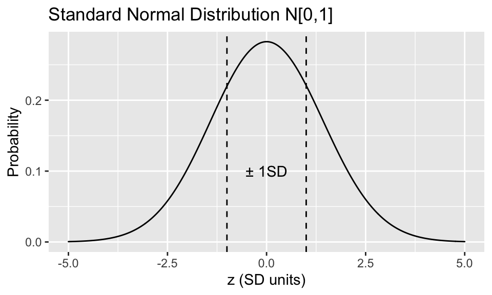
A normally distributed \(x\) can be standardized via \(z = \frac{x-\mu}{\sigma}\). This is the standard normal or Z distribution with with mean = 0, SD = 1 i.e. x is transformed into a Z-score measured in SD units
A Gaussian distribution has many convenient properties:
There is a formula called the probability density function that associates each possible value of x with a probability: \(P[x] = \frac{1}{\sqrt{2 \pi} \sigma} e^{(\frac{x-\mu}{\sigma})^2}\). Obviously, you don’t need to know this formula, but you should appreciate some important consequences from it:
-
It depends on only 2 parameters, the mean \(\mu\) and the standard deviation \(\sigma\)
-
The probability of an observation falling between any two points is just the area under the curve (the integral) between these two points, which you will find in a Z table at the back of almost any statistics text.
As a result, Gaussian data are completely characterized by their mean and standard deviation, which makes them ideal data summaries. In contrast, skewed data are assymmetrically distributed with a long tail to either the left or right. The central tendancy for a skewed distributions is more appropriately summarized by its median (= \(50^{th}\) percentile = the value below which half the data falls), and its dispersion is described by its interquartile range (\(25^{th}\) - \(75^{th}\) percentiles).
From the integrated probability curve, we have some very important rules of thumb for data that are (close to) normally distributed, which you really should commit to memory:
-
\(\mu \pm 1 \sigma\) spans 67% of the data
-
\(\mu \pm 2 \sigma\) spans 95% of the data (actually 1.96 \(\sigma\))
-
\(\mu \pm 3 \sigma\) spans 99% of the data
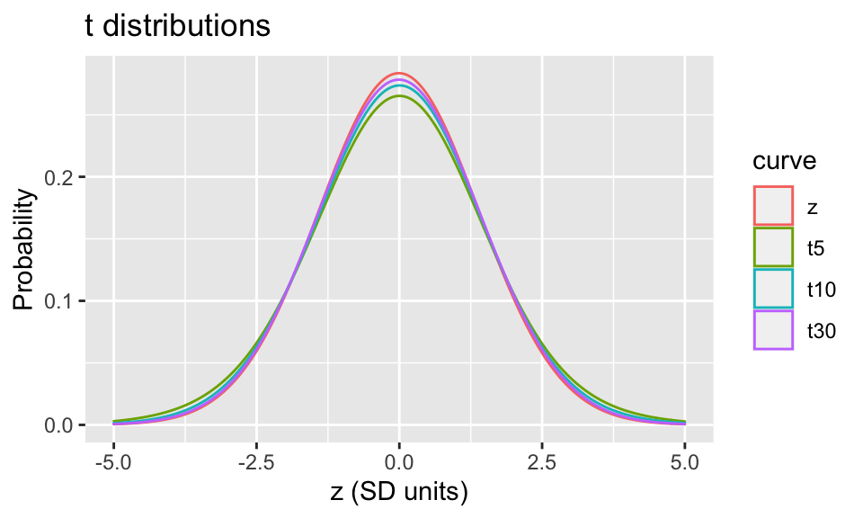
Clearly, the distribution of continuous data are important so you can summarize them properly; Gaussian distributions are also important in statistical inference. Through the magic of the central limit theorem and maximum likelihood estimation procedures (more later), most statistical models return parameter estimates that may be assumed to be normally distributed, with some \(\mu\) and \(\sigma\). Unfortunately, we rarely know the true population parameters, and we are obliged to replace them with their sample estimates when making inferences e.g. calculating p-values or confidence intervals. As a result, the Z distribution no longer applies. Instead, the results are now decribed by the Student’s t-distribution with n degrees of freedom. Although the math gets complicated, the \(t_n\)-distributions also have probability density functions for calculating probabilities, and you can find analogous tables in the back of any statistics text.
There are 2 things you should notice here
-
The Z and t distributions are virtually identical beyond about 30 observations, so the distinction is most important for small sample sizes
-
The tails of the t-distribution are fatter with larger area under the curve, which means that unlikely events occur more often with the t-distributions
Consequently in the real world, p-values and confidence intervals should be calculated with the t-distribution rather than the Z-distribution (i.e. you want to use a t-test when comparing means)
2.3 Continuous Data
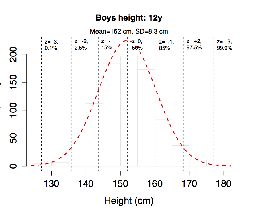
For example, here are height measurements on the 861 boys aged 12y used to create the WHO growth charts for Canada, with a mean of 152 cm and an SD of 8.3 cm. If you compare the empiric distribution (histogram) with the theoretical normal distribution for this mean and SD (dashed red line), the fit is excellent, which means we can use the mean and SD to describe your sample. Then for any height value, we can calculate the corresponding z-score or percentile from the normal distribution, where the \(x^{th}\) percentile is generally defined as the value that exceeds x% of the data. For example, values to the left of z = -2 will occur with a probability of 2.5%. From this, you should also appreciate that the difference between z = -2 (2.5%) and z = +2 (97.5%) represents 95% of the population. The following z-scores and corresponding percentiles should already be familiar to you from clinical growth charts.
Of course, not all measures are normally distributed, even approximately. Here is the distribution of weights on the same boys, with a clear right skew. In this case, the data are better described by the median and interquartile range, which spans 50% of the sample.

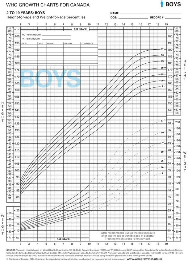
These examples also make the point that percentiles are a useful way to summarize large amounts of data, whether or not the data are normally distributed. As you know, Celia and I spent close to two years of our lives on the re-analysis of the original WHO data to create the new Public Health Agency of Canada’s 2014 WHO Growth Charts for Canada. I am therefore confident that you will plot every child you see on a growth chart like this one, which is the usual boys height and weight chart. For any age between 2-19 years, you are given the percentile distribution of heights and weights, from the \(3^{rd}\) to the \(97^{th}\) percentiles. Height below the \(3^{rd}\) percentile is by definition stunted. Weight that crosses two percentile curves is defined as failure to thrive. So percentile curves and z-scores are important clinical tools in pediatrics.
2.4 Categorical Data
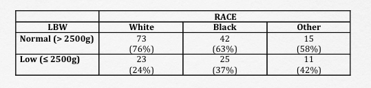
Contingency tables (cross-tabulations) are used to summarize count data. To illustrate, we will use a dataset with 189 observations from a study looking at the determinants of low birth weight in Springfield, MA1. We will return to this study a number of time through this workbook, but for the moment let us examine the relationship between birthweight and race.
- This is a 2 x 3 contingency table with categorical row and column variables. The low birth weight indicator
lowidentifies newborns with low birth weight (\(\leq\) 2500g), and the race variable identifies parental race as ‘white’, ‘black’, or ‘other’. - To facilitate interpretation, it is helpful to include column (or row) percentages
To make this easy, every statistical package has a cross-tabulation function, which you should learn how to use e.g. xtabs() or table()
table(low, race)
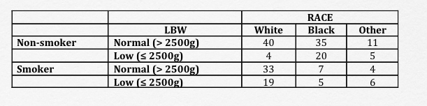
There’s really no limit to the number of dimensions you can cross-tabulate when your statistical package is doing the heavy lifting. Here, we have a 2 x 2 x 3 table, where we’re further breaking down the numbers based on maternal smoking habits. Unless you examine the data this way before further analysis, you may miss the fact that the cell sizes (counts in each subgroup) are becoming too small to analyze meaningfully even though the total sample size appears to be robust.
table(low, race, smoke)
Hosmer and Lemeshow, Applied Logistic Regression, 2013↩︎