4 Bivariate relationships
4.1 Box and Whisker Plots
Box and Whisker Plots are used to explore the relationship between continuous numeric and categorical variables. For example, we might wish to examine the relationship between birth weight (continuous) and the 3 race categories by summarizing their individual distributions.
In a previous course, you will probably have met the so-called ‘five number summary’ of a data distrbution, namely the range (min, max), IQR, median, and mean. While comprehensive, it’s not particularly concise.
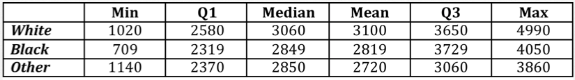
In contrast, the Box and Whisker plot graphically depicts most of this information and is considerably easier to interpret.
Graphical features:
Thick line in box = Median or \(50^{th}\) percentile
Lower hinge (bottom) of box = first quartile or \(25^{th}\) percentile
Upper hinge (top) of box = 3rd quartile or \(75^{th}\) percentile. As we saw before, the difference between the upper and lower hinges is the interquartile range (IQR).
Whiskers = range of values falling within 1.5 IQR’s of the box.
Open circles = outlier values
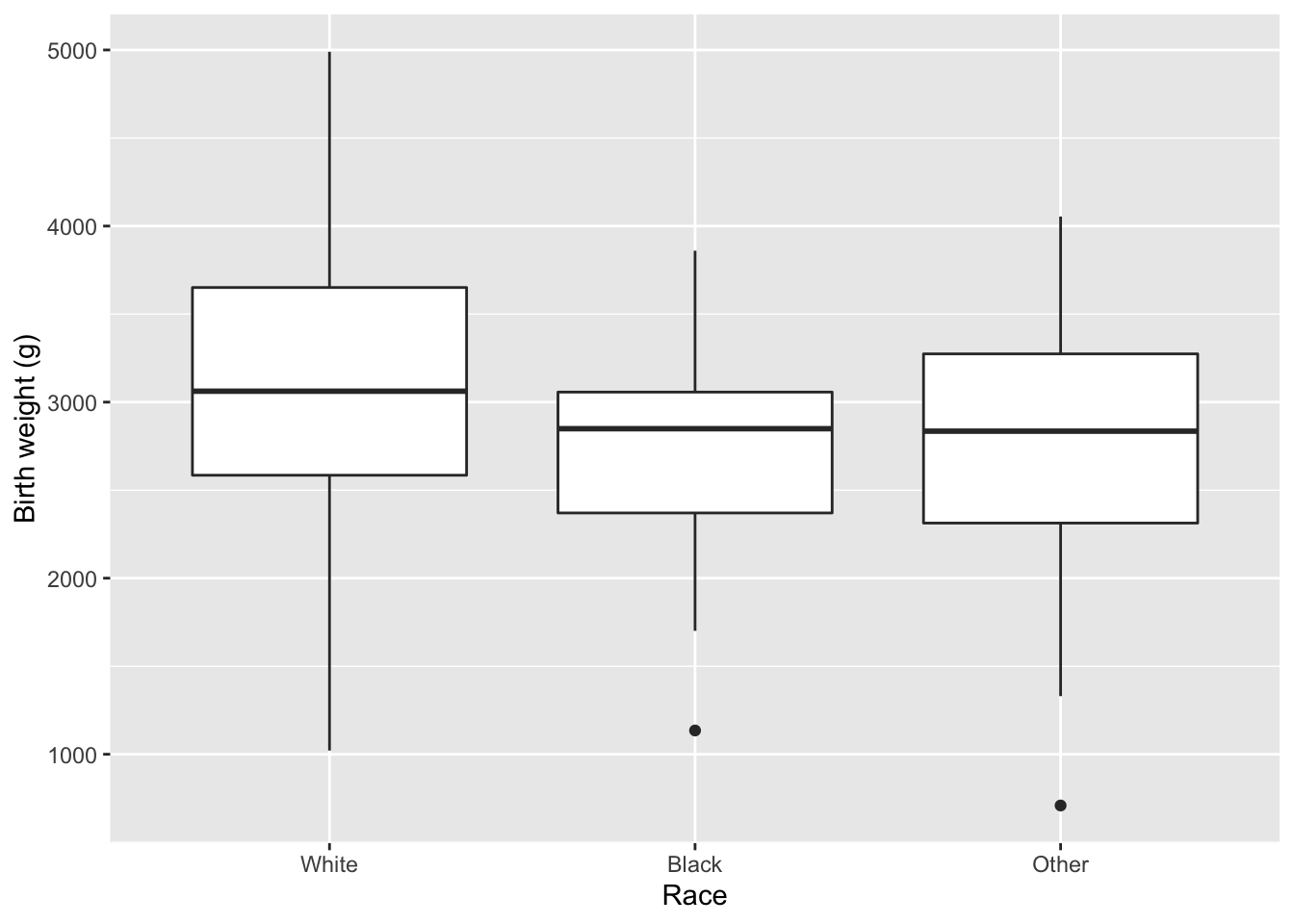
4.2 Scatterplots
XY scatterplots are used to explore the relationship between two continuous variables
Here, we plot birth weight (y) against pre-pregnancy maternal weight (x). It may be helpful to use different symbols for various subgroups e.g. race.
It is also useful to superimpose the best-fit linear regression line to identify a linear relationship between the two variables. Here, you can see there is a weak linear relationship. I also find it helpful to superimpose a LOWESS smooth (locally weighted regression smoothing, aka LOESS), which a non-parametric, non-linear moving average for estimating trends in the mean value. Since the two are almost identical, we can comfortably model the relationship as linear.
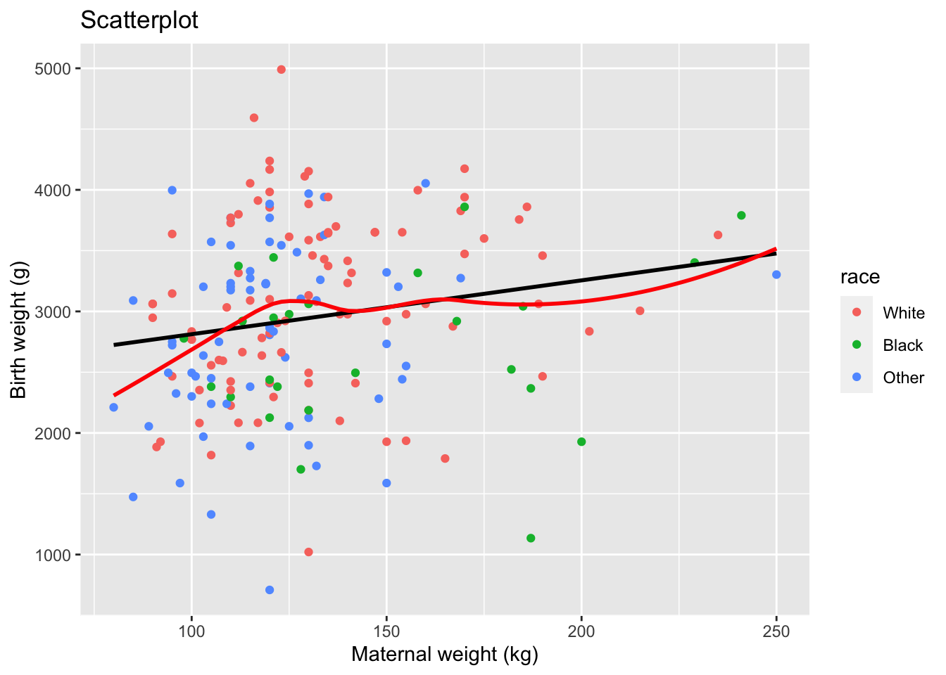
4.3 Pearson Correlation
It’s one thing to visualize a bivariate relationship, but we may also want to measure its strength. Below is the definition of the covariance between two numeric quantities x and y. When x \(>\) \(\bar{x}\) AND y \(>\) \(\bar{y}\), the summand on the right-hand side adds to the covariance. The same is true if they’re both smaller than their respective means, since the product of two negative numbers is positive. In either case, we say they covary. However, when one is above the mean and one is below the mean, the summand has a negative sign, which will reduce the covariance. Since the covariance is the sum of these individual terms, it tells us whether x and y covary or move in the same direction.
\(Cov[x,y] = \frac{1}{N} \sum_{i=1}^N (x_i - \bar{x})(y_i - \bar{y})\)
We will usually prefer to normalize the covariance by dividing by the respective standard deviations, which yields the Pearson correlation r, a number between -1 and 1 that measures the strength of the linear association between the two variables.
\(Corr[x,y] = r = \frac{Cov[x,y]} {\sigma_x \cdot \sigma_y}\)
We can also simulate some random data to show you how various correlations manifest themselves in a scatter plot.
Although the Pearson r is the most common measure of association for continuous variables, it does assume a bivariate normal distribution. When this assumption is not satisfied, there are non-parametric correlation coefficients that can be used instead. By ‘non-parametric’, we simply mean that we’re not assuming any particular distribution.
Spearman rho (\(\rho\)): based on rank order
Kendall tau (\(\tau\)): based on number of concordant pairs (where pairs are concordant if the signs of the differences are the same for x, y)
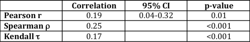
Like the Pearson correlation, both return a measure between -1 and 1. By way of example, we can look at the relationship between newborn weight and maternal pre-pregnancy weight from our earlier scatterplot. In this case, we see that all 3 measures are similar:
4.4 The value of data exploration
This may seem obvious, but you should always look at your data before you start worrying about inferential statistics or complicated statistical models. Simple descriptive statistics and graphical exploration may identify unexpected patterns and often assist with planning more formal analyses.
For example, as a second year medical student, Tanya Kapher recently spent a summer with Celia reviewing all cases of septo-optic dysplasia (SOD) in the endocrine, genetics, and ophthalmology clinics over the past 20 years. As you know by now, SOD is a congenital CNS malformation complicated by pituitary insufficiency and optic nerve hypoplasia, making it the third most common cause of pediatric blindness in North America. To everyone’s surprise, she observed a dramatic increase in the annual incidence. As you can see from the LOWESS smooth, there has been an 800% increase in the number of cases diagnosed annually in Manitoba, beginning in about the year 2000. Prompted by this finding, they worried about the role of environmental exposures and wanted to explore where these children came from.

Fortunately, it’s easy to convert postal codes into longitudes and latitudes using the postal code conversion file (PCCF) from Statistics Canada. This file maps each postal code in the country to a census dissemination area (DA), a socially homogenous neighbourhood of 400-700 people that represents the smallest geographic unit in the regular census. In a city like Winnipeg, we can easily see that each DA corresponds to 1-2 residential blocks.
Kapher,...Rodd, 2017: Increasing incidence of optic nerve hypoplasia/septo-optic dysplasia spectrum: Geographic clustering in Northern Canada.
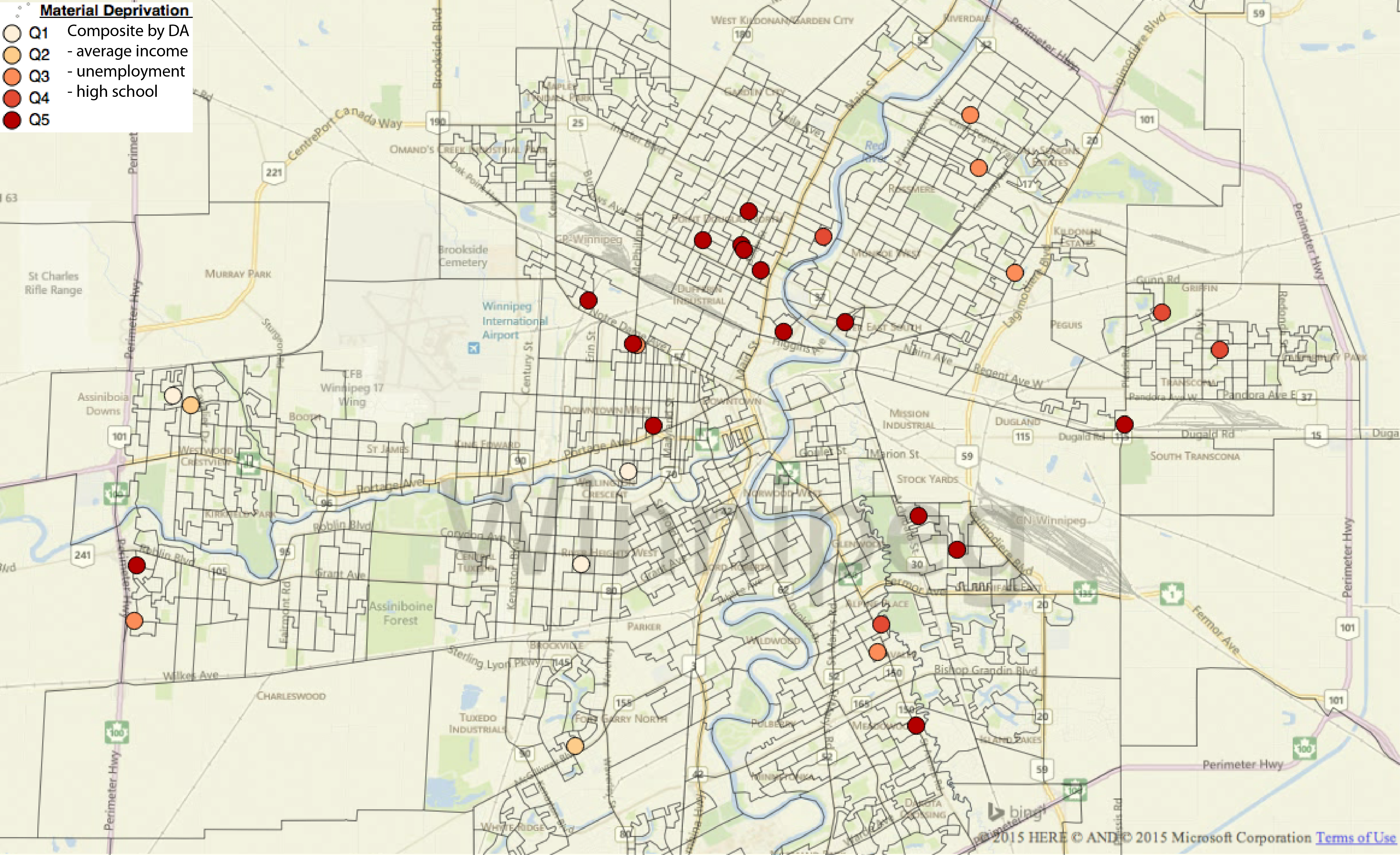
As a result, we can place patients on the map and easily examine the relationship between disease distribution and any census measures of interest. For example, every DA in the country is associated with a material deprivation index (DI), which is a composite measure of socioeconomic status (SES) based on neighbourhood family incomes, high school completion rates, and unemployment levels. Here, we’ve color coded each patient by their neighborhood DI quintile (higher quintiles \(\equiv\) more deprivation) so that we can study the relationship between disease and socioeconomic status. This is important, since we’re almost always interested in this relationship, and SES is almost never documented in the medical chart. Higher deprivation quintiles identify more deprived neighbourhoods, and you can readily appreciate a preponderance of cases in poorer neighborhoods with DI Quintiles 4-5. The distribution is even more extreme outside of Winnipeg.
Geomapping is a powerful tool with many applications. We can, for example, count the number of patients in specific regions or measure their distance to the nearest hospital, nursing station, school, or large body of water; to illustrate, here we counted patients in each federal electoral district (FED), which typically have populations of 80-100k. As a result, counts are easily translated into population adjusted rates.
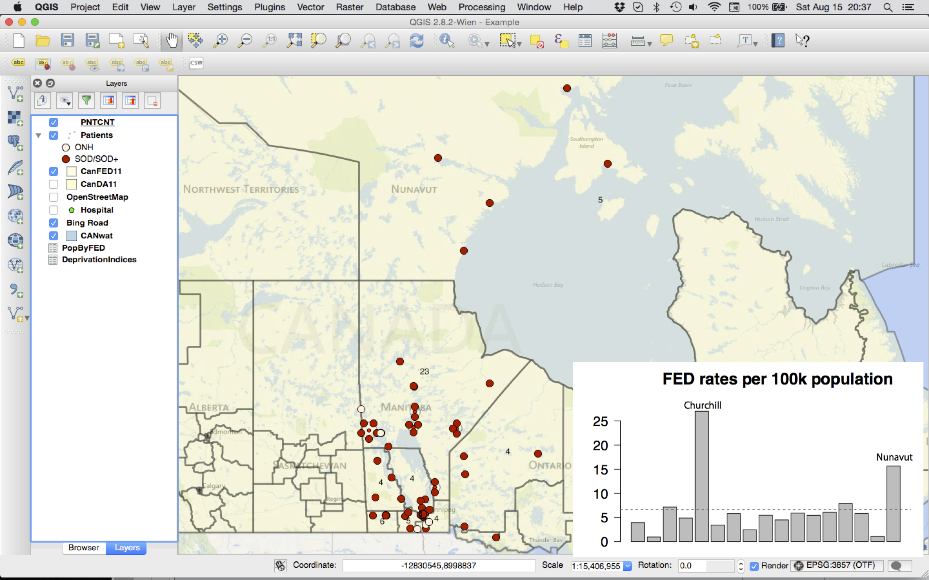
As you can see, there were 23 cases in the Churchill FED compared to 4-5 in most of the adjacent districts, which makes it even more clear that Churchill and Nunavut are over-represented compared to their populations (bottom right).
But the point I’m trying to make is that this is an important and novel observation relating SOD to northern communities and impoverished neighborhoods. Moreover, this work was done by a second year medical student simply by looking at her data, since you will note that I have yet to mention a single p-value!
Geomapping is an increasingly important tool for medical research. In a recent study of Manitoba population data, we applied 12 different area based socioeconomic measures (ABSM) to 20 paediatric health outcomes, including infant mortality, vaccine uptake, hospitalization rates, and teen pregnancies, and confirmed socioeconomic inequalities for 19 of 20 outcomes! To our surprise, the best single predictor was income quintile, which identified 16 of 19 confirmed inequalities; for example, teen pregnancy rates were 10.8 times higher in the lowest vs highest income quintile. Since SES data are often missing from the medical chart, we’ve added a new chapter to the primer that shows you how to convert Manitoba postal codes to ABSM, which includes census data files for the province.