3 Graphical Summaries
The appropriate choice of graphical display method depends on variable type e.g.
Categorical data:
Continuous, numeric variables
Bivariate relationships
dot plots
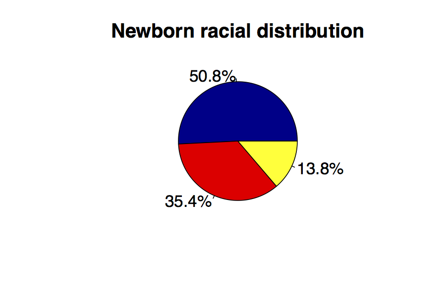
3.1 Pie Charts
Edward Tufte writes that “The only worse design than a pie chart is several of them”. And despite your undergraduate experience with Excel and PowerPoint, you should probably avoid pie charts in scientific publications:
With more than 3 slices, it’s hard to judge their relative sizes
For clarity, you usually must add % or numbers to the chart – so the graphics add little
Barcharts can communicate more information more effectively
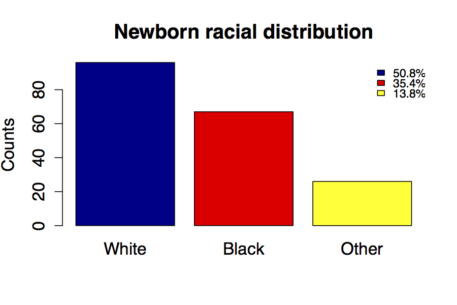
3.2 Bar charts
Bar charts are a more versatile way to display count data from a contingency table. Unlike the pie chart, you can easily read numbers or proportions from the y axis:
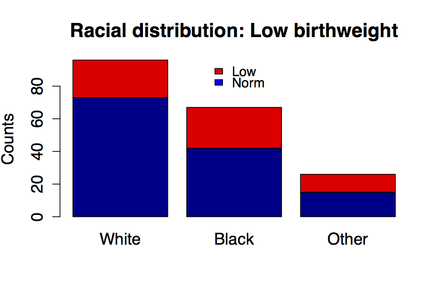
Stacked barcharts communicate even more information than the pie or simple bar chart. Here, we see the racial composition of the newborn population as well as the numbers and proportions with low birth weight in red.
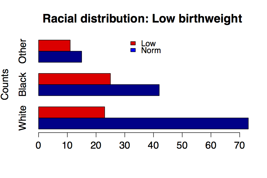
A grouped barchart is another way to display the same information, and you can always flip the axes if you prefer.
3.3 Histograms
Histograms are like bar charts except the bars touch to emphasize the continuous rather than discrete nature of the bins or categories. Here, we let the software arbitrarily decide the bin size of 500g on the x axis using the default Sturges algorithm. The y axis displays the numbers (or proportions) in each bin.

You are not restricted to equal bin sizes e.g. if there are some natural groupings. Although the software will try to create a “pretty picture” using some default algorithm, you may also need to try several bin sizes or algorithms.
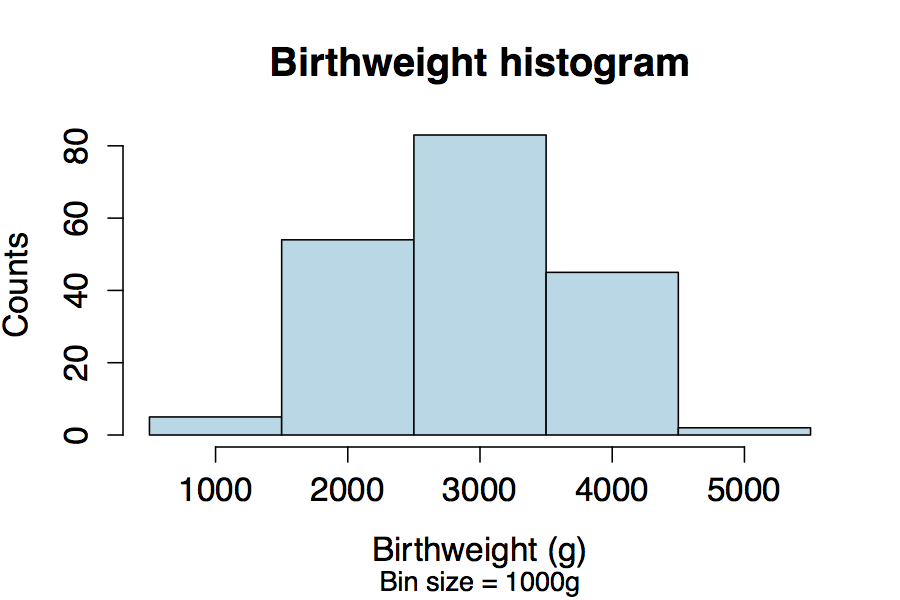
If we have too few bins, we can over-smooth the data and lose important information about its variability. Here the bin size is 1000g.
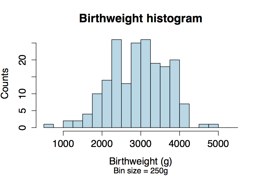
If we have too many bins, we can start to capture spurious fluctuations due to sampling variation. Here the bin size is 250g. Clinical judgement may be needed.
3.4 Kernel Density Plots
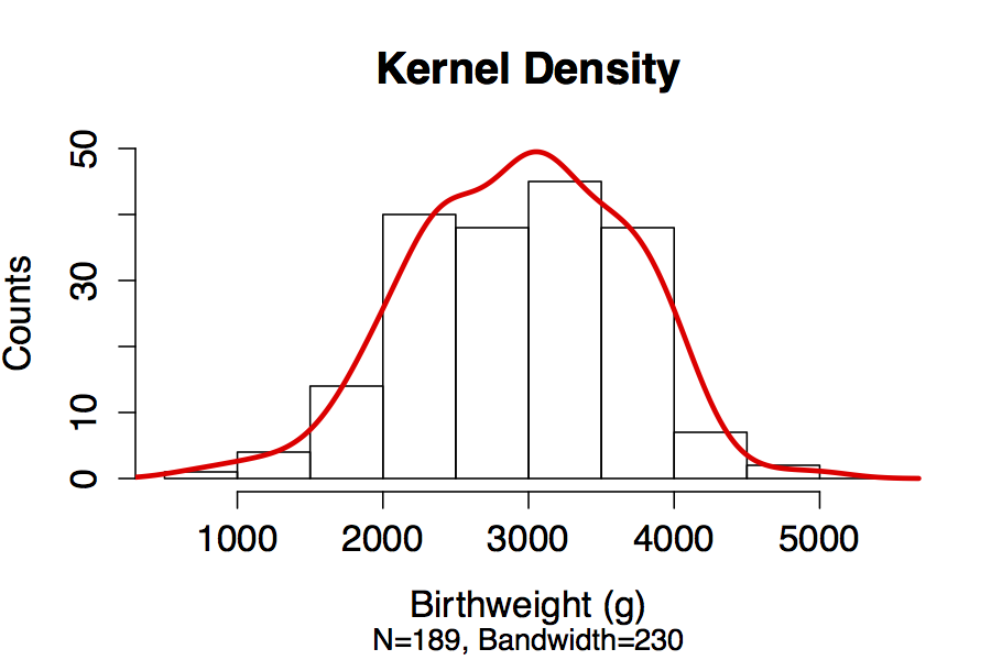
For continuous data, we might wish to examine the continuous distribution by smoothing the histogram using what we call kernel density estimation. Here, we superimpose the default kernel density over the default histogram. The default algorithm chose a bandwidth of 230, which determines how smooth the resulting density will be.
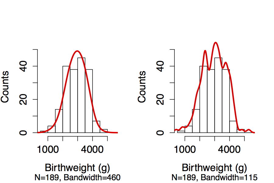
By increasing the bandwidth, we sacrifice some detail to buy a smoother estimate (left). On the right, we’ve opted for less smoothing and may be capturing random variation in the distribution.
Again, you may need to try several bandwidths and compare, using your clinical judgement to decide which makes the most sense.
3.5 Stem and Leaf Plots
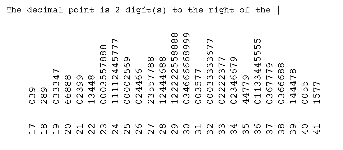
Although stem and leaf plots look a bit primitive, they remain a useful way to graphically summarize continuous data. They also display the distribution of continuous numeric data like birthweight, but include more information than a histogram. Like a histogram, the shape of the plot shows you the distribution across bins. In addition, the plot actually displays the raw data, so it is much easier for others to compare their results.
In this example, the second bin contains birth weights in the range 1800-1900 grams for 3 babies: So we have one baby at 1820g, another at 1880g, and another at 1890g. In the next bin for weights between 1900 and 2000g, we have 6 babies: One at 1900g, 3 babies at 1930g, 1 at 1940 and one at 1970g.
3.6 Quantile-Quantile Plots
While a histogram provides a quick visual check on the normality of a data distribution, a more formal test is the so-called quantile-quantile or QQ plot, which compares the observed data (here birthweight) against what we would expect from a specific theoretical probability distribution. In this example, we compare to a normal distribution, but we could easily have chosen t distribution, a poisson distribution etc.
When the empiric and theoretical distributions match, the result is a straight line. Here, we compare the actual distribution with the solid line of identity and it’s 95% confidence intervals (dashed). Based on this visual assessment, we conclude that birth weight is very near to Gaussian in its distribution. A note of caution: When assessing normality, visual inspection of a distribution is usually sufficient. Although formal tests do exist (e.g. with p-values), they can be misleading, since even small deviations will be statistically significant if the sample size is large enough. In the end, it’s a judgement call that requires some experience.
